

Introduction
The CSS position property is used to set position for an element. It is also used to place an element behind another.
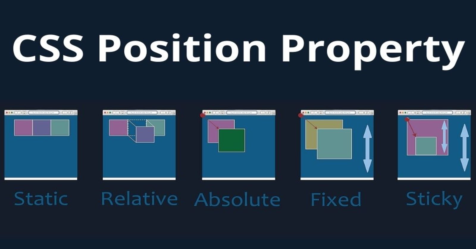
We can position an element using the top, bottom, left and right properties. These properties can be used only after position property is set first. This positioning property has five different methods namely static, relative, absolute, fixed, sticky.
Let's have a look at following CSS positioning:
1. CSS Static Positioning
The default position for an element is position: static; which doesn't have any effect on the element.
<!DOCTYPE html>
<html>
<head>
<style>
p {
   margin: 0;
}
div:first-child {
   position: static;
   background-color: orange;
   text-align: center;
}
</style>
</head>
<body>
<div>Demo text</div>
<p>This is demo text wherein we are displaying an example for static positioning.</p>
<div></div>
</body>
</html>
2. CSS Relative Positioning
If we set position: relative; on an element, we are now able to position it with an offset, using the properties
- top
- bottom
- left
- right
which are called offset properties.
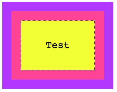
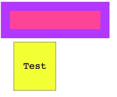
Taking an example to show CSS Position Property
<div class="parent">
  <div class="child">
    <div class="box">
      <p>Test</p>
    </div>
  </div>
</div>
with some CSS to give some colors and padding, but does not affect positioning:
.parent {
  background-color: #af47ff;
  padding: 30px;
  width: 300px;
}

.child {
  background-color: #ff4797;
  padding: 30px;
}

.box {
  background-color: #f3ff47;
  padding: 30px;
  border: 2px dotted #333;
  font-family: courier;
  text-align: center;
  font-size: 2rem;
}
here’s the result:
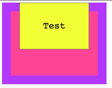
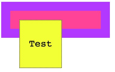
Now if we set position: relative to the box, at first apparently nothing changes. But the element is now able to move using the top, right, bottom, left properties, and now you can alter the position of it relatively to the element containing it.
For example:
.box {
  position: relative;
  top: -60px;
}
3. CSS Absolute Positioning
Setting position: absolute; on an element will remove it from the document’s flow, and it will not longer follow the page positioning flow.
With absolute positioning, as soon as we set position: absolute; on .box, its original space is now collapsed, and only the origin (x, y coordinates) remain the same.
We can now move the box around as we please, using the top, right, bottom, left properties:
For example:
.box {
  position: absolute;
  top: 140px;
  left: 50px;
}
4. CSS Fixed Positioning
Like with absolute positioning, when an element is assigned position: fixed it’s removed from the flow of the page.
The difference with absolute positioning is this: elements are now always positioned relative to the window, instead of the first non-static container.
Another big difference is that elements are not affected by scrolling.
For example:
.box {
  position: fixed;
  top: 0;
  left: 0;
}
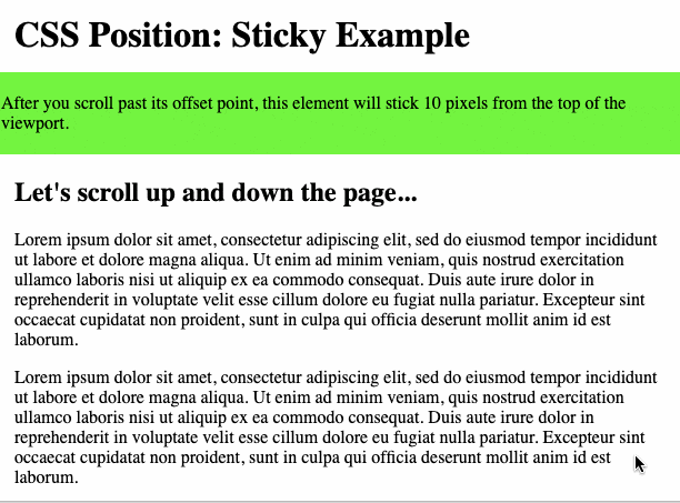
5. CSS Sticky Positioning
In CSS, sticky positioning has traits of relative and fixed positioning. A sticky element is positioned relative to its initial position in the HTML flow until it crosses a specific threshold in the viewport (ie. the user scrolls past a certain point on the page). At that point, the element sticks in place, like a fixed element, until it reaches the boundary of its parent element. This offset point is defined by specifying top, right, bottom, or left in the CSS position property.
Here’s an example of the syntax of the sticky position in CSS:
Here’s the HTML with a lot of dummy text to see the effect of the sticky positioning more clearly:
<div>
  <h1>CSS Position: Sticky Example</h2>
</div>
<div class="stickyexample">
  <p> After you scroll past its offset point, this element will stick 10 pixels from the top of the viewport.<p>
</div>
<div class="container-fluid">
  <h2>Let's scroll up and down the page...</h1>
     <p>Lorem ipsum dolor sit amet, consectetur adipiscing elit, sed do eiusmod tempor incididunt ut labore et dolore magna aliqua. Ut enim ad minim veniam, quis nostrud exercitation ullamco laboris nisi ut aliquip ex ea commodo consequat. Duis aute irure dolor in reprehenderit in voluptate velit esse cillum dolore eu fugiat nulla pariatur. Excepteur sint occaecat cupidatat non proident, sunt in culpa qui officia deserunt mollit anim id est laborum.</p>
     <p>Lorem ipsum dolor sit amet, consectetur adipiscing elit, sed do eiusmod tempor incididunt ut labore et dolore magna aliqua. Ut enim ad minim veniam, quis nostrud exercitation ullamco laboris nisi ut aliquip ex ea commodo consequat. Duis aute irure dolor in reprehenderit in voluptate velit esse cillum dolore eu fugiat nulla pariatur. Excepteur sint occaecat cupidatat non proident, sunt in culpa qui officia deserunt mollit anim id est laborum.</p>
     <p>Lorem ipsum dolor sit amet, consectetur adipiscing elit, sed do eiusmod tempor incididunt ut labore et dolore magna aliqua. Ut enim ad minim veniam, quis nostrud exercitation ullamco laboris nisi ut aliquip ex ea commodo consequat. Duis aute irure dolor in reprehenderit in voluptate velit esse cillum dolore eu fugiat nulla pariatur. Excepteur sint occaecat cupidatat non proident, sunt in culpa qui officia deserunt mollit anim id est laborum.</p>
     <p>Lorem ipsum dolor sit amet, consectetur adipiscing elit, sed do eiusmod tempor incididunt ut labore et dolore magna aliqua. Ut enim ad minim veniam, quis nostrud exercitation ullamco laboris nisi ut aliquip ex ea commodo consequat. Duis aute irure dolor in reprehenderit in voluptate velit esse cillum dolore eu fugiat nulla pariatur. Excepteur sint occaecat cupidatat non proident, sunt in culpa qui officia deserunt mollit anim id est laborum.</p>
     <p>Lorem ipsum dolor sit amet, consectetur adipiscing elit, sed do eiusmod tempor incididunt ut labore et dolore magna aliqua. Ut enim ad minim veniam, quis nostrud exercitation ullamco laboris nisi ut aliquip ex ea commodo consequat. Duis aute irure dolor in reprehenderit in voluptate velit esse cillum dolore eu fugiat nulla pariatur. Excepteur sint occaecat cupidatat non proident, sunt in culpa qui officia deserunt mollit anim id est laborum.</p>
     <p>Lorem ipsum dolor sit amet, consectetur adipiscing elit, sed do eiusmod tempor incididunt ut labore et dolore magna aliqua. Ut enim ad minim veniam, quis nostrud exercitation ullamco laboris nisi ut aliquip ex ea commodo consequat. Duis aute irure dolor in reprehenderit in voluptate velit esse cillum dolore eu fugiat nulla pariatur. Excepteur sint occaecat cupidatat non proident, sunt in culpa qui officia deserunt mollit anim id est laborum.</p>
</div>
Here’s the CSS you’d use to create a lime green
.stickyexample {
  position: -webkit-sticky;
  position: sticky;
  top: 10px;
  background-color: #00ff00;
  padding: 3px;
}
body {
  margin: 0;
}
h1, .container-fluid {
  margin: 15px;
}
Here’s the result: